A custom UI kit used to update the financial firm’s internal systems and create a designated homepage for users to begin their day.

Challenge
To create a central source of reference - where new and current employees can efficiently answer any questions they may have, push out the newest updates, and feel at 'home' (even away from the office).
Solution
A custom UI kit was designed, developed, and used to improve the Quantlab digital experience by creating a central homepage where employees can see and access any updates or important information for their daily routine. This UI kit was also used to provide direction on updating their current internal systems to revamp their brand to a more modern state.
Approach
We began by first getting to know how the current Quantlab sites are organized and what information they provide to users.
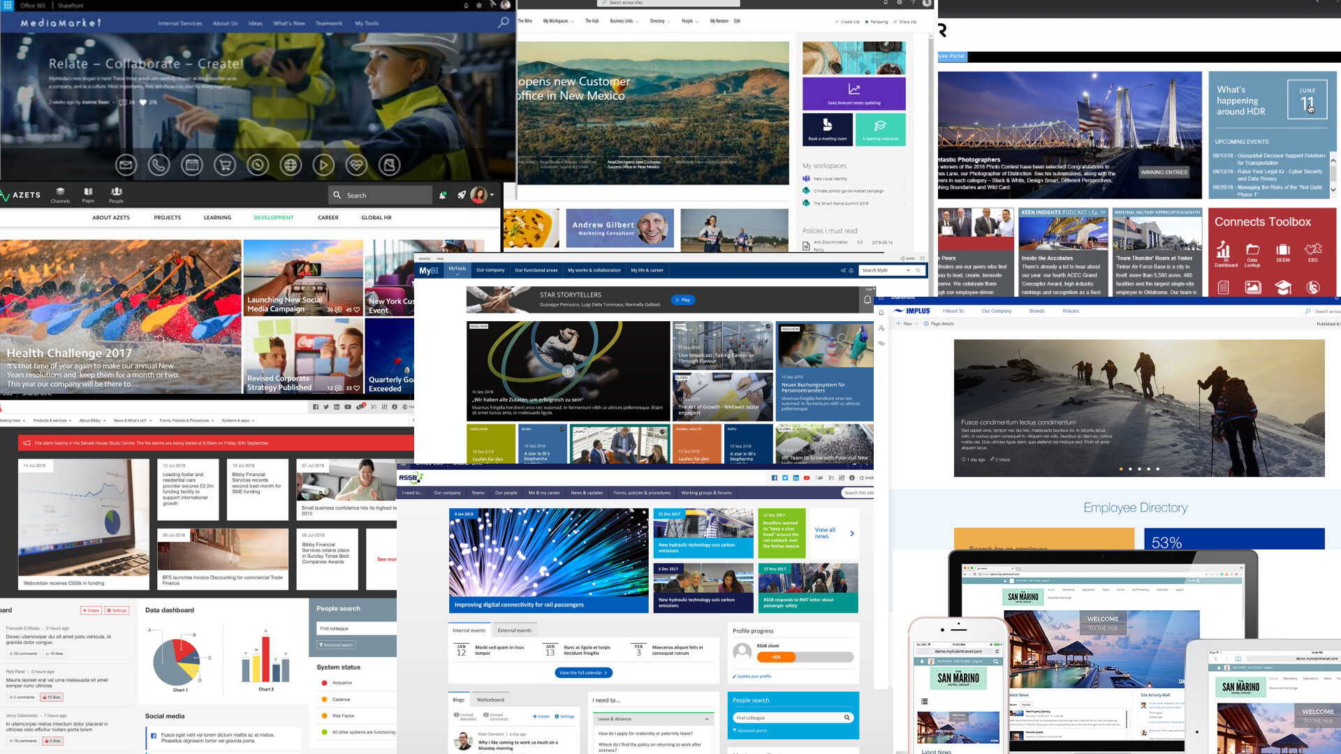
Current Quantlab Sites

Quantlab does not currently have a dedicated homepage, thus having multiple different products house different types of sites. Department pages are accessed through one product, announcements through another product, etc.
The Approach
We then continued to interview all 8 individual stakeholders to get their opinions on the current state of the Quantlab internal system as well as their current workflow. These were the 3 main points from these stakeholder interviews.
1. Ad hoc
Many processes have moved to ad hoc Slack or email communications.
2. Unorganized
While the information itself is useful, the difficulty of navigation discouraging use.
Research
We followed up the stakeholder interviews by sending out a survey for employees to provide information on their site usage.

Current Site
Information stored in pages is buried, resulting in unnecessary questions to the respective department administrator; leading to an overall desire to aggregate towards one central source of reference.
Needs
With the gathered data from interviews, survey, and site map, we were able to establish the main needs to be addressed.
1. Employees should be able to quickly answer…
Who does (x) work for?
How do I best contact them?
What is the standard process for finding HR policies? …booking travel? …reserving conference rooms?
What’s for lunch?
2. Contributors should be able to easily update…
Employee information
Latest documentation
Compliance
HR policies
Lunch menu
Anniversaires, birthdays, etc.
3. Developers should be able to…
Easily create new pages
Update branding of current pages
Competitor Analysis
With context on the current state of Quantlabs site usage, we continued by researching other systems to get insight on features, content, and established organizational structure.
Some commonalities that we observed throughout the system research are
1. Hero section
The top section of the site is large and mainly informational. This is usually filled with carousels of announcements.
2. Dashboard inspired design
Most homepages have a modularesque type of design and organizational structure; like dashboards.
3. Quicklinks
Most links within these homepage designs act as a repository of sorts. Not housing many, if any, in-page interactions.
Ideation
Taking the competitor analysis and keeping the established needs in mind, we began ideating how we could best organize the homepage to answer these needs.

Ideation
Since the Quantlab homepage will be the main “go-to” for users to access any and all documents, department pages, and links, one of the main focuses was having an area of “quicklinks” that can house all of these important links.
We decided on a modular design for the Quantlab homepage. This direction will allow Quantlab to reorder, reorganize, remove, customize, and make any type of page necessary for their departments and needs.
Lo-Fi Mockups
As we transitioned to designing lo-fi mockups, we continued with these two main focuses: a section to keep users up to date, and a modular design to allow customization.
Feedback
We brought the lo-fi mockups to the stakeholders so they could provide feedback as we worked through the modularesque design direction.
While the carousel hero header is a good direction for announcements and any articles, the search function took too much priority and room in this direction.
The direction with a calendar modal priority would not be easily feasible and would add an unnecessary additional calendar to the users’ workflow.
Style Guide + UI Components
Before we could begin work making the system components, we needed to establish a style guide for the Quantlab brand.
The style guide encompasses the brand colors, text colors, and since there was no brand typeface, we established a typographic system as well.
Style Guide + UI Components
With a style guide established, we could now transition to working on the system components. There were two main things to focus on when making these components.
Modal Components
These components would be specific to creating the Quantlab homepage and would be reused in other department-specific homepages.
General Components
These components would be used in creating any other general pages and be used to update Quantlab’s current pages.
Modal Components

General Components
Site Redesign
For the redesign of the Quantlab site, we were to focus on 4 main pages that were to be used to provide direction for the Quantlab team as they updated the rest of their internal sites.
Quantlab Homepage

HR Department Homepage

Quantlab Directory Page

Food Menu Input Page

Validate
We conducted some validation testing of the new designs with 10 users.

Misunderstanding (conclusion)
After validating the designs with employees and stakeholders, we passed on the designs to the developer lead so the components could begin development. Then the site pages could be developed as well.
With the components complete, the lead Quantlab developer and team approached us to discuss how they could use the components within Figma to create new pages. The Quantlab team was under the impression that Figma produced code-ready designs ready to be shipped.
We explained that Figma is used to design the pages before using the developed React components to be recreated. To make up for Quantlab’s lack of design knowledge and process, we set up time to walk them through the process Figma designs to developed screens.